 7d62615513
Redesign repo header with following new aspects: - responsive & better-looking repo title - hide repo button text instead of icons in mobile view - use same tab style as on explore and org page <details> <summary>Before:</summary>    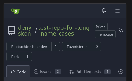 </details> <details> <summary>After:</summary> 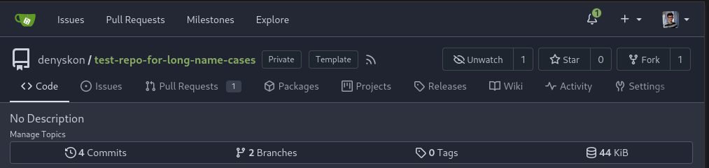   
101 lines
2 KiB
CSS
101 lines
2 KiB
CSS
.fork-flag {
|
|
margin-top: 0.5rem;
|
|
font-size: 12px;
|
|
}
|
|
|
|
.repo-header {
|
|
display: flex;
|
|
flex-flow: row wrap;
|
|
justify-content: space-between;
|
|
gap: 0.5rem;
|
|
}
|
|
|
|
.repo-header .flex-item {
|
|
padding: 0;
|
|
}
|
|
|
|
.repo-header .btn.interact-bg:hover {
|
|
text-decoration: none;
|
|
}
|
|
|
|
.repo-header .flex-item-main {
|
|
flex-basis: unset;
|
|
}
|
|
|
|
.repo-header .flex-item-trailing {
|
|
flex-wrap: nowrap;
|
|
}
|
|
|
|
.repo-header .flex-item-trailing .repo-icon {
|
|
display: none;
|
|
}
|
|
|
|
.repo-buttons {
|
|
align-items: center;
|
|
display: flex;
|
|
flex-flow: row wrap;
|
|
word-break: keep-all;
|
|
gap: 0.25em;
|
|
}
|
|
|
|
.repo-buttons .ui.labeled.button > .label:hover {
|
|
color: var(--color-primary-light-2);
|
|
background: var(--color-light);
|
|
}
|
|
|
|
.repo-buttons button[disabled] ~ .label {
|
|
opacity: var(--opacity-disabled);
|
|
color: var(--color-text-dark);
|
|
background: var(--color-light-mimic-enabled) !important;
|
|
}
|
|
|
|
.repo-buttons button[disabled] ~ .label:hover {
|
|
color: var(--color-primary-dark-1);
|
|
}
|
|
|
|
.repo-buttons .ui.labeled.button.disabled {
|
|
pointer-events: inherit !important;
|
|
}
|
|
|
|
.repo-buttons .ui.labeled.button.disabled > .label {
|
|
color: var(--color-text-dark);
|
|
background: var(--color-light-mimic-enabled) !important;
|
|
}
|
|
|
|
.repo-buttons .ui.labeled.button.disabled > .label:hover {
|
|
color: var(--color-primary-dark-1);
|
|
}
|
|
|
|
.repo-buttons .ui.labeled.button.disabled > .button {
|
|
pointer-events: none !important;
|
|
}
|
|
|
|
.repository .header-wrapper {
|
|
background-color: var(--color-header-wrapper);
|
|
}
|
|
|
|
.repository .header-wrapper .new-menu {
|
|
padding-top: 0 !important;
|
|
margin-top: 0 !important;
|
|
margin-bottom: 0 !important;
|
|
}
|
|
|
|
.repository .header-wrapper .new-menu .item {
|
|
margin-left: 0 !important;
|
|
margin-right: 0 !important;
|
|
}
|
|
|
|
@media (max-width: 767.98px) {
|
|
.repo-header .flex-item {
|
|
flex-grow: 1;
|
|
}
|
|
.repo-buttons .ui.labeled.button .text {
|
|
display: none;
|
|
}
|
|
.repo-header .flex-item-trailing .label {
|
|
display: none;
|
|
}
|
|
.repo-header .flex-item-trailing .repo-icon {
|
|
display: initial;
|
|
}
|
|
}
|